Table
This documentation is under construction
Use the table component to make information easier to compare and scan for users
When to use this component
Use the table component to let users compare information in rows and columns.
When not to use this component
Never use the table component to layout content on a page.
How to use
General structure
Wrap a table in a <div class="kth-table" tabindex="0">
- The
kth-tableclass makes sure that horizontal scroll is contained in the table, ensuring compliance with WCAG 2.1 SC 1.4.10 Reflow (Level AA). The table can have horizontal scroll, but not the entire page - The
tabindex="0"attribute ensures that keyboard users can scroll the table horizontally, which is a requirement to compy with WCAG 2.1 SC 2.1.1 Keyboard (Level A)
Code
<div class="kth-table styleweb-table" tabindex="0">
  <table>
    ...
  </table>
</div>
Table caption
TODO
Numeric values
- Use the class
kth-table__cell--numericin all cells with numeric values. Use the class also in the column header. - Make sure that all numbers in the same column have a consistent format: same number of decimal numbers and same prefixes or suffixes
Code
<div class="kth-table" tabindex="0">
  <table>
    <thead>
      <tr>
        <th scope="col">Month</th>
        <th scope="col" class="kth-table__cell--numeric">
          Maximum temperature (°C)
        </th>
        ...
      </tr>
    </thead>
    <tbody>
      <tr>
        <th scope="row">January</th>
        <td class="kth-table__cell--numeric">6.66</td>
        <td class="kth-table__cell--numeric">-1.21</td>
      </tr>
    </tbody>
  </table>
</div>
Fixed width
KTH Style does not include any styles for tables with fixed width but you can follow these recommendations in case you need them:
- Set width to one cell in each column, the easiest way is to style the
thin header. - Use CSS property
min-width - Use tree-structural CSS pseudo-classes like
:nth-child,:first-child,:last-child, etc. to select specific columns
.custom-class thead th {
  &:first-child {
    min-width: 8rem;
  }
  &:not(:first-child) {
    min-width: 9rem;
  }
}
Sortable columns
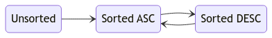
A column in a table can be sortable or not sortable. In case it is sortable, it can be in one of these three states:
unsorted. users can click the column to sort it after the column but is currently not sortedsorted ASC. Sorted in ascending ordersorted DESC. Sorted in descending order
KTH Style provides icons to indicate all three states. Note that non sortable columns have no icon
To style the sortable columns
- Add the class
kth-table__column--sortableto indicate that you can sort a column - Add the attribute
aria-sort="ascending"oraria-sort="descending"to indicate that the table is sorted by that column. Do not include the attribute if the column is not sorted - Add a
<button>element inside the column header cell to indicate interaction (sorting). Make sure that click event listeners are added to this button, not to the container cell.
Code
<div class="kth-table" tabindex="0">
  <table>
    <thead>
      <tr>
        <th
          scope="col"
          class="kth-table__column--sortable"
          aria-sort="ascending"
        >
          <button>Month</button>
        </th>
        ...
      </tr>
    </thead>
    <tbody>
      <tr>
        <th scope="row">January</th>
        ...
      </tr>
    </tbody>
  </table>
</div>
Sorting behavior
When the user clicks on a sortable column, the table becomes sorted by that column in ascending order. If the user clicks again, the sorting is reversed. All other columns become unsorted.
Note: the initial state can be any of them